Common Small Business Website Mistakes That Reduce Inquiries
Website issues that are often easy to fix and can strongly affect trust and conversion.
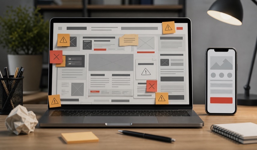
What stops visitors from sending an inquiry.
It is unclear what the company does
If visitors cannot understand what you offer, who you serve, and where you work in a few seconds, they need extra effort. Most users will not do that.
Contact is not visible enough
Phone, email, form, and CTA should be a natural part of the user path. If contact exists only in the footer, the website loses potential inquiries.
- CTA above the fold when relevant
- contact buttons in key page sections
- short inquiry form for more complex projects
- clear message about what happens after sending an inquiry
Content sounds generic
Phrases such as “high quality and affordable” do not differentiate a company. It is better to explain specific services, process, experience, references, and expected outcome.
The website is not technically stable
Slow rendering, images without dimensions, broken forms, poor mobile layout, and outdated content reduce trust and rankings.
How this connects to the next step
If you are planning a new business website, the article should not stay only informational. It should help the decision. That is why this guide links to the relevant page website design for small businesses and to the website inquiry form, where you can describe the goal, industry, and content you already have.
- define the website goal and main services
- prepare existing materials, images, and examples
- send an inquiry so the scope and structure can be estimated
How to prioritize improvements
Fix problems that interrupt contact first: a broken form, unreadable mobile layout, hidden phone number, or unclear offer. Then improve pages for priority services, references, and trust signals. Only after those foundations are clear should you expand the blog or spend time on minor visual changes.
Measure improvements with relevant signals: qualified inquiries, pages that lead users to the form, search queries that attract the intended audience, and behavior on key pages. If the current website cannot support these goals, review our website redesign approach.
Problems usually appear across the complete contact journey
Visitors first need to understand the offer, then gain confidence, and finally send an inquiry without friction. If one step is missing, additional traffic may not produce more clients.
Common issues to review
- the heading describes the company instead of the problem it solves,
- several services are combined into one short and unclear page,
- case studies are only images without objectives or delivered work,
- contact controls are hidden or the form requests excessive information,
- mobile layouts use small copy, crowded buttons, or slow media,
- company, process, privacy, and support information is missing.
How should fixes be prioritized?
Start with pages that receive impressions or visits but few contacts. Review the main message, call to action, mobile experience, and form before adding new articles. The first objective is helping current visitors complete the next step.
For systematic improvement, review website redesign or send a project assessment inquiry.
Planning a similar project?
If you want to apply this advice to your business website, review the related services or send a short inquiry so we can estimate the scope.